
Presto Self-Serve Reload Kiosk
UX/UI Redesign | Usability Test
Project Brief
PRESTO has offered travellers and commuters electric reload/payment machines in the transit system in GTA (Great Toronto Area). Passengers can load PRESTO cards on a self-serve reload kiosk at select TTC, GO train, and UP Express stations.

Project Scope:
Time Expanse: 6 weeks
Team Size: 5 team members
In this UX project, my major responsibilities are: directing the UX research and managing interviews of TTC riders at different subway locations (Osgoode, High Park, Finch, and York Dale) and, designing the kiosk user interface. Tasks include:
[+] Prepare interview scripts and form constructive questions
[+] Analyze notes and synthesize negative/positive tones, body languages from users
[+] Generate user empathy maps and user flow
[+] Create interactive prototypes

The Challenge
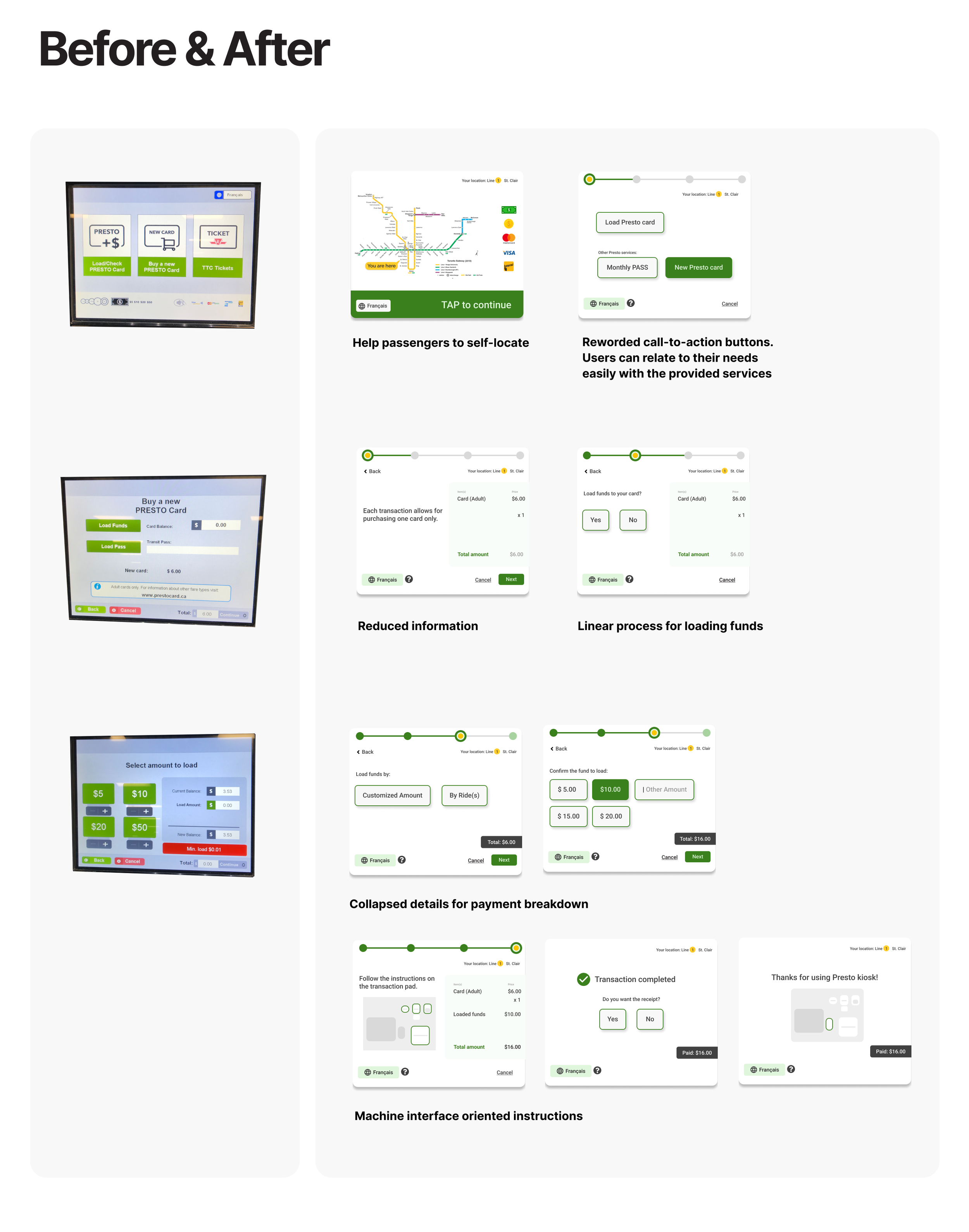
It’s found in the research phase that even though regular users found the machine is super easy to use, first-time users need to spend lots of time and desire extra assistance to complete an action on the kiosk. This brings up the question towards the effective communication delivered by the micro-copy writing.
User scenario:
Shelley and Sue are visiting some childhood friends who still live in Toronto. As first-time / occasional users, like Shelley and Sue, usually find it hard to associate their travel needs with the action buttons on the kiosk. They get stuck on the landing page of the kiosk staring at those three buttons, even though the label texts on them are not uncommonly used vocabularies/language.
The steps below (user empathy map, problem statement, and the UI heuristic analysis) entail how the problem was defined.

To ease the “get a Presto card and load some fund” experience for the public transit rider group like Shelley and Sue who are occasional riders or first-time kiosk user, how might we improve the flow and interface on the kiosk to reduce the friction for the users starting from the landing page, so that the reload/top-up process can be as natural as talking to a subway teller?
Frictions in the current user journey
There’s overwhelming amount of information presented after passengers tap “Get a new presto card” button and the placement of the information is a little chaotic. Without knowing how many steps are coming up, it slows down the process to complete the get a presto card task.


A service blueprint is generated for this reload service kiosk to engage several service components, including typical user group, props, and process. Just like an extended version of user journey map. The blueprint depicts a more wholesome dynamic from human-machine interaction to human-to-human interactions in a service cycle. Some subway stations may not be equipped with TTC staff, so human interactions may not be involved.
Wireframe and Prototypes Iterations
It took at least three rounds of iterations to finalize the prototype. Some UI related concerns were raised and tackled during usability testings.
[ ] Should we provide full-control to the users/passengers to collapse and expand the payment amount breakdown
[ ] What’s the best practice to display “a confirmed amount” so that users can be assured to move to the next step


Challenges encountered
Two major challenges were found in the prototype iteration and usability testing sessions:
Personal preferences and user’s thinking path could result in polarized product experiences.
Green is the branding colour for PRESTO, but green doesn’t always mean green (for vision impaired folks).